Liquidity Trickle at Risk
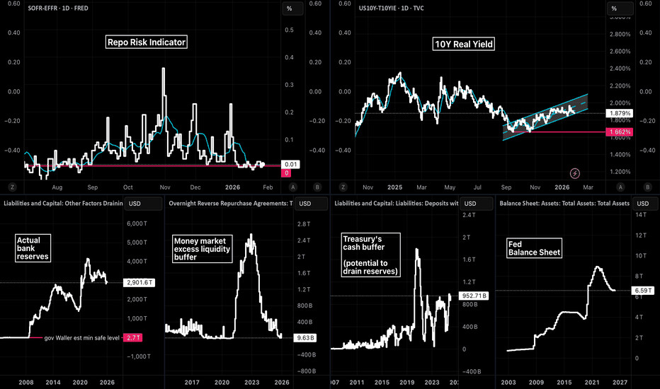
This dashboard is built around a simple idea: short-term funding can look calm while liquidity support quietly fades . The top-left panel, FRED:SOFR − FRED:EFFR , is the “plumbing alarm.” When it rises, secured funding is getting more expensive relative to unsecured funding—often a sign that cash is getting scarce in the places that matter. Right now, that spread is muted, which tells us the system isn’t showing acute overnight stress yet.
But the buffers underneath the plumbing are thinner than they look.
RRP usage is near depleted , meaning the money-market “shock absorber” that used to soak up Treasury issuance is largely gone. With that buffer drained, a TGA rebuild ( FRED:WDTGAL rising) is more likely to show up as a direct drain on bank reserves rather than being offset by cash rotating out of RRP. That’s why FRED:WRESBAL matters: it’s the remaining cushion.
So why have we seen risk assets wobble even without a repo-spread flare-up?
Because the market is trading the marginal impulse—and that’s increasingly about the Fed’s balance sheet .
The second chart is the focal point: after the post-COVID QT downtrend, the recent action looks like milder QT / a small balance-sheet “trickle” rather than an aggressive, continuous drain. Even a small easing in the slope can matter at the margin for the most liquidity-sensitive corners of the market.
That’s where expectations around leadership and posture enter. Kevin Warsh is widely perceived as hawkish on the balance sheet —more inclined toward discipline, faster normalization, and less tolerance for “stealth easing.” If markets start pricing a higher probability of that kind of balance-sheet stance, the implication is straightforward:
the recent trickle of liquidity